

The Pareto Chart is a powerful tool that maintains the quality of services and products. Decision making is steered in the right direction, meaning efforts are streamlined to maximize output quality.
When implemented properly, Pareto analysis – via the Pareto chart – will identify major pitfalls in any business process in order to improve quality. This analysis uses the Pareto principle, that is, 20% of defects account for 80% of quality problems, or conversely, 80% of quality problems result from only 20% of causes.
In this FAT FINGER article you’ll learn what a Pareto chart is and when this tool should be used. You’ll then learn how to create a Pareto chart in 10 simple steps, plus how to interpret your results to achieve the greatest improvements to your business output. Sounds good?
- What is a Pareto chart?
- How to create a Pareto chart in 10 steps (worked example)
What is a Pareto chart?
You can think of a Pareto chart as a Bar Chart (specifically a Histogram) and a Line Graph combined. The bars within a Pareto chart represent frequency and cost (time or money), and are arranged with the longest bars to the left and the shortest bars to the right. This gives a visual depiction of which situations are more likely to occur.
A Pareto chart also includes a Line Graph which shows the cumulative percentage. This is important because, according to the Pareto principle, in any group of factors that contribute to a common effect, relatively few account for the majority of the effect. You’ll learn more on this later, so keep reading.
Where did the Pareto chart originate from?
The theory behind the Pareto chart originated in 1897, developed by the Italian economist Vilfredo Pareto. Following on from Pareto’s thinking, Dr J.M. Juran found that most defect distributions in a system follow a similar pattern, that is, a relatively small number of issues account for an overwhelming share of the defect. Juran applied the principles of Pareto to defect analysis – to separate the vital few from the trivial many and named this the Pareto chart .
When do you need to use a Pareto chart ?
Pareto charts are essentially quality control tools. In Business, Pareto charts are used:
- When analyzing data about the frequency of problems in a business process.
- When there are a number of problems or causes in a business process and you want to focus on the most significant.
- When analyzing broad causes to process issues by looking at their specific components.
- To communicate information about your data with others.
The benefits of Pareto analysis
What’s arguably the most important benefit of Pareto analysis is it’s an easy way to identify and determine the main cause of a problem. Pareto analysis helps streamline efforts to reduce defects in business processes. Pareto analysis does this by identifying and focusing on the main defects (those that cause the majority of the problems).
With the help of the Pareto chart, one can also determine the cumulative impact of a defect. This cumulative impact measures the effect a defect is having on the quality of a product or service over a long period of time.
With this information, one can plan, analyze, and resolve problems with the help of a Pareto chart.
How to create a Pareto chart in 10 steps (worked example)
For a better explanation of what a Pareto chart is, we’ll work through an example to illustrate this chart’s use.
Let’s say you want to find out what your main customer pain points are. By knowing this, you’ll be able to focus your efforts and solve the most pressing problems, to deliver an exceptional user experience.
Step #1: Document your business processes
Documenting your processes is your first step to Pareto analysis. You can do this easily in FAT FINGER. Documenting business processes helps you identify problems such as process inefficiencies and bottlenecks.
Use FAT FINGER’s drag-and-drop checklist builder to document your business operations as you work through them. Use FAT FINGER’s features such as Conditional Logic, Approvals and Multiple Choice to build complexity into these documented processes. Do this for every process that keeps your business operational. When your finished, you’ll have a library of documented processes easily accessible from your FAT FINGER account.
For more information about FAT FINGER and how to document your business processes using this tool, watch the below video.
Next, identify common errors by looking at your documented processes and aligning these with customer complaints.
For instance, let’s say you own a tech product company. At the moment, there’s a delay between when a customer pays for a product, and the point where this payment is processed to schedule product delivery. This has caused a number of customer complaints as customers wait anxiously to get the product they purchased.
Because you documented your Customer Onboarding Process in FAT FINGER, you can identify this payment approval step as a significant process bottleneck. Here, you’ve matched the customer complaints with the relevant business process.
Do the same for all your customer complaints and sub-par processes.
Next, group process issues into contributor categories. For instance:
- Contributor one: Slow approval
- Contributor two: Document sourcing
- Contributor three: Excess packaging
- Contributor four: Slow customer service resolution
With this information, it’s time to create your Pareto chart.
Step #2: Sum the number of instances for each contributor
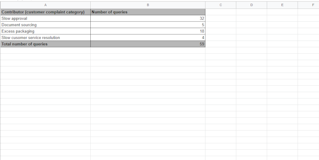
We’ve listed each complaint/query under a single contributor category, in this example we have four. We’ve then added the queries together to get a total of 59.
Step #3: Order the contributors from the largest to the smallest
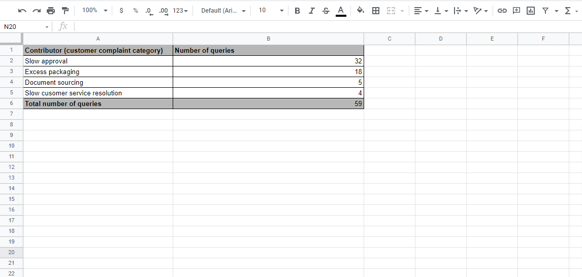
Order the contributors according to the frequency of queries. In our example, slow approval comes out as having the most associated complaints.
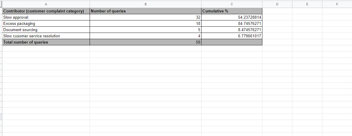
Step #4: Determine the cumulative-percent of total
For instance, the cumulative percentage of the third contributor is the sum of the effects of the first two in rank order, divided by the grand total, and then multiplied by 100.
In our example, the calculations are as follows:
- Cumulative percentage for slow approvals: (32/59) x 100 = 54.24%
- Cumulative percentage for excess packaging: ((32+18)/59) x 100 = 84.75%
- Cumulative percentage for document sourcing: ((8+18+32)/59) x 100 = 8.47%
- Cumulative percentage for slow customer service resolution: ((32+18+5+4)/59) x 100 = 6.78%
The resulting table is named a Pareto table, as shown below.
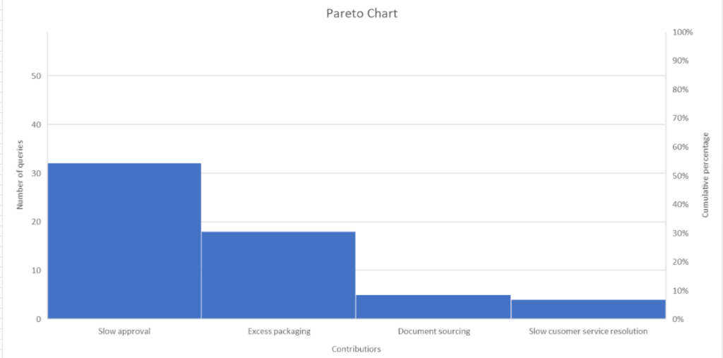
Step #5: Draw and label the left vertical axis
Next it’s time to create your Pareto chart using the data in your Pareto table.
Label the vertical axis from 0 to the grand total or just beyond. Provide a caption to describe the measure used. In our example, the vertical axis represents the number of complaints.
Step #6: Draw and label the horizontal axis
You’ll then want to divide the horizontal axis into as many divisions as there are contributors, in frequency order. Provide a caption to describe these contributors, for instance, in our example the contributors are slow approval, document sourcing, excess packaging and slow customer service resolution.
Note: If the contributor names are too long, you can denote them using A,B,C, etc. to provide a transparency key.
Step #7: Draw and label the right vertical axis
A Pareto chart has two axes – you guessed it, one on the left and one on the right. This time, you’ll want to label the right axis from 0 to 100. Line up 100 percent with the grand total, which in our example is 59.
This also means that 50% on the right axis should line up with 29.5 on the left axis in our example.
The caption of the right vertical axis is cumulative percent.
Step #8: Draw bars to represent the magnitude of each contributor’s effect
The height of the bars corresponds to the magnitude of that contribution as measured on the left axis.
You should have a bar chart that looks something like the one below. Next, it’s time to add the cumulative percentages.
Step #9: Draw the cumulative percentage as a line graph
Each successive contributor’s effect will add to the cumulative total. Ideally you’ll want to put these points above the right-hand edge of each bar. As you can see in the image below, we’re limited by Excel’s capacity and this hasn’t been possible.
You can do a quick calculation check by looking at the cumulative percent for the first ranked contributor. The cumulative percent measured on the right axis should be the same height as the first bar. If it’s not, then you should check your calculations.
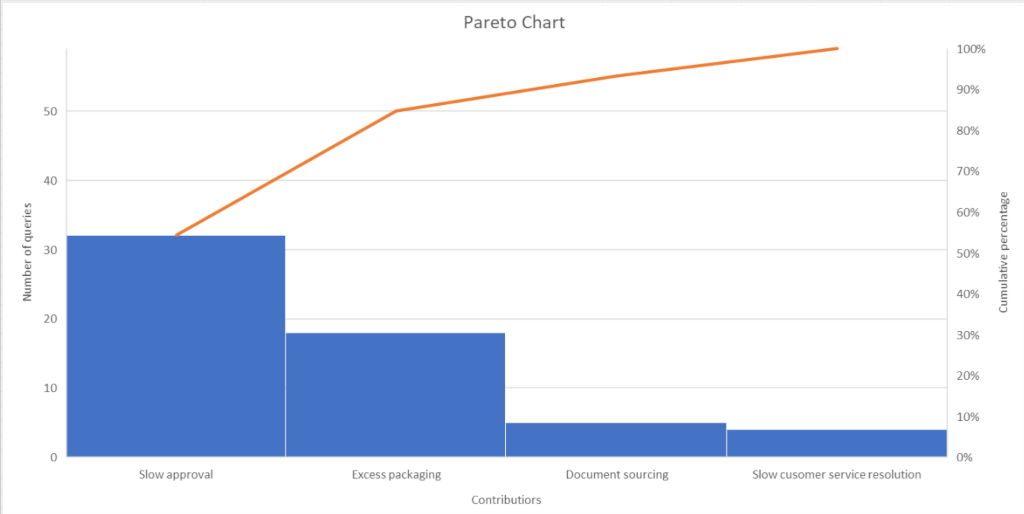
Once you’ve drawn the cumulative frequency line, you should end up with a chart similar to the above. This is a Pareto chart.
Step #10: Analyze your Pareto chart using the 80/20 rule
Next, analyze your Pareto chart to determine the contributors that are of highest priority. Pareto principles tell us to go by the 80/20 rule to categorize contributors as vital few or useful many.
Let’s explain this principle further. You see, when many individual contributors are looked at, it’s apparent that only a few account for the majority of the total effect on quality. This means it’s typical for a few business process steps to account for the majority of the negative impacts on quality. If your attention is focused on this vital few, then you’ll achieve the greatest potential gain from your efforts.

As you can see, in the image above, the 80/20 rule has been applied to our Pareto chart example. Using the cumulative frequency percentage we can determine which contributors we need to focus our efforts on.
The majority of complaints are associated with slow approvals leading to a delay between when a customer purchases their product, until when the client receives the product they’ve paid for.
Implementing systems to alleviate this pain point will reduce 80% of service complaints, and ultimately improve the quality of your offering. In this instance, we could use FAT FINGER’s approval process control feature to streamline the approval process, as we notice this feature hasn’t been incorporated in our Customer Onboarding Process. Incorporating this feature removes the process bottleneck, and 80% of complaints are resolved.
Obviously, this worked example gives a simplified version of the Pareto chart in action. Pareto charts really come into their own when handling large amounts of data.
How to create your Pareto chart using Excel
You can create a basic Pareto chart easily using Microsoft Excel. Simply enter complaint contributors, and then total the number of queries for each complaint to create a Pareto table. From here, you can calculate the cumulative percentage. Then highlight the data (the contributors, the number of queries and the cumulative percentage), as this is the information you’re going to use to create your chart.
Once the data is highlighted, go to Insert > Charts > All Charts > Histogram > Pareto chart
Make sure to set your left axis (the number of queries) to include the total number of queries, otherwise your right axis (the cumulative percentage) will not match.
Easily streamline your business operations using the Pareto chart
Pareto analysis using the Pareto chart ultimately saves you time while simultaneously delivering optimal results to your business development efforts. The Pareto principle is a powerful rule that helps focus your efforts to alleviate the business process problems causing the most harm.
Once more, applying the Pareto principle is simple. To conclude this article, we’ve summarized the process below:
- Document your business processes in FAT FINGER.
- Categorize the contributing process errors, tally the number of queries to each contributor, and calculate the cumulative percentage. This is your Pareto table.
- Create your Pareto chart using the data in your Pareto table via Excel.
- Using the cumulative percentage, determine which contributors account for 80% of quality defects.
And there you have it, Pareto analysis in a nutshell, to consistently bring quality to your customers.